These are all Type 1 PostScript fonts. I am happy to make them available for free to anyone who wants to use them in a publication. They're incredibly time-consuming, so I haven't made any new ones in a very long time.
Checco 1999
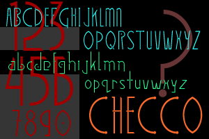
Checco pays homage both to the elegant circuitry of microCHips and the streamlined forms of art dECO. This sample of Checco shows the strong contrast between the tall capitals and the lowercase letters. Checco was used as the display font in the bookBenjamin's Blind Spot. It has two weights, regular and bold.
TriHexal 1999
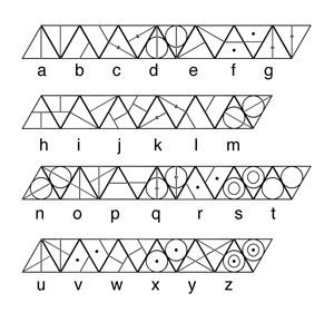
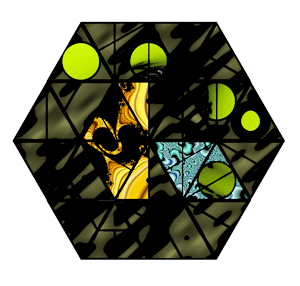
TriHexal is a font in which all the letters take the form of triangles. It was designed especially so that it would be possible to create geometric forms from words typed in this font. For this reason, each letter has two fors, an upward-pointing triangle, and a downward-pointing triangle. The fact that the base form is a triangle makes it easy to create hexagons with these letters; hence the name "TriHexal." The 'image' above right is actually this poem: "today / allgods / aregone / where".
Cross 1996
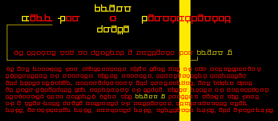
The Cross font was designed specially for use in a Web project, the X-Art Foundation's blast5drama. The letterforms contain only right angles for crispness in a pixel-based environment. It was a tongue-in-cheek attempt to make a font that would be simultaneously legible and cryptic. It is named for Marlena Corcoran's story, "Crossroads," as each letter itself forms a miniature crossroads.
UnCross 1999
UnCross is a legible variant on my Cross font.
Vilhelm 1995
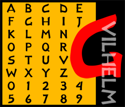
Vilhelm is a display font created and named in honor of Richard Wilhelm, the great translator of the I Ching.
Forger 1995
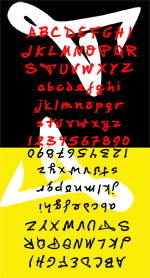
Forger is a font very loosely based on my own handwriting (and a good deal more legible!). It has two weights, regular and bold.